Thursday, January 31, 2008

COLOR


Here is another example of the use of the seaglass color. I have used it here in my knitting - oh by the way I am addicted to knitting! I learned many years ago and have not stopped. I really love all of the fibers, textures and colors. I like the fact that I can combine whatever colors and stitches that I like. It has always been a stress buster for me, it is hard to explain but has something to do with the rythem of it. Occationaly I like to try a more challenging pattern, but usually I like something with a simple knit stitch and gorgous lush yarn.
Here I have combined a cashmere blend seaglass color, a wool mohair of the same color, a wool chartruse and a wool mohair bottle glass green.

NEW F.SCHUMACKER FABRICS


I always love getting New Fabrics from my fabric houses. F.Schumacher is know for it's exclusive beautiful fabricic. Many of their patterns are recreated from their archives of historic fabrics. If a pattern is recreated from the archives there is always a document color or and exact reprodution and several other color ways based on current color trends.
Over the last few years I have seen more and more detail in fabric, wich is evident here in 2 of these. The fabric in the middle is a silk with sewn on rick rack, a complicated and precise fabric to make, but what a unique look. I can just imagine it made into roman shades, bedding - duvet cover, tailored bed skirt, shams and or pillows. The fabric on the right is a printed fabric with emboidery over the printed pattern. This gives a posh dimentional effect that is delighting. This one is a more contemporary fresh patterns. The fabric to the far left is a more traditional floral available in three colors.
Current color trends are always exciting because that represents change. The seaglass blue is such a big color trend right now and has been strong for several years. I think it is a stong trend becuase it is soothing ( important at a time of war and unsteading econimics ). This color can also be combined with so many other colors sucessfully, mocha, lime, raspberry, red, mustard/butter yellow, coral, navy/cobalt. I am even combining it right now in my knitting with chartruse and a clear green. (see another blog... )I would love to hear and see how you have used it. Contact me on my e-mail, cjvandaff@comcast.net

Monday, January 28, 2008

IT'S ALL IN THE DETAILS PART 2


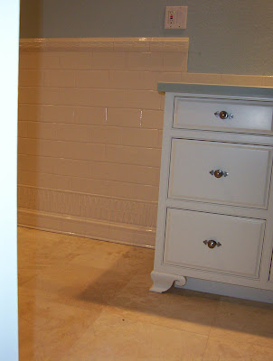
I want to talk about the design process and share with you how I get from point "A" to point "B" so to speak. In this project we were redesigning the bathrooms, laundry room and the kitchen. At the same time that we were layout out the cabinetry, first for function then for aesthetics I was researching tile. I discussed with my client a color pallet, I comunicated that to my rep in the showroom and she sent me a box of the most amazing tile options within those colors. At the same time we are working with plumbing options and cabinet color options and counter materials. When using "whites" it is important for them to match, so I co-ordinated the plumbing, tile and cabinet whites. The metals also need to work together. I don't believe that they all have to match but they do need some harmoney. This includes, faucets, cabinet hardware, towel bars and door hardware. Once we have looked at some of the tile options then it is up to me to start putting them together to create a design. As you can see from the finished photos I used many different tiles together. I start with a scaled elevation drawing of the areas and start fillling it in with tile. These scaled drawings then go to the tile installer to estimate the amount of tile that I need to order and he also uses these to install from. The results here are quite beautiful. A coordinated affort between first the home owner, Designer, showroom rep, builder and the tile installer. Thank you to the "team".

Thursday, January 24, 2008

CUTEST MODULAR HOME EVER!


This is the cutest modular home that I have ever seen! I think that I could live in one of these. I wish that I had been able to see inside, but it was a Sunday and the office was closed. I believe that good design should be available to all people reguardless of income. This is proof!

Wednesday, January 23, 2008

REGIONAL COLOR AND DESIGN - ARIZONA


There is a facinating aspect to design based on it's region or loacation.I found that especialy true in Arizona, it couldn't be more different than Michigan. I talked earlier about the clarity of light but the colors were equaly facinating. The Scottsdale, Phoenix, Mesa area is surrounded by mountains. These mountains dominate the scene everywhere you look. They are extrodinary. Thier color changes all day long. I especialy liked the late afternoon sun light. There was a romance to it, that reflected the twinkle in your eye. The colors seemed to become more brilliant and of course the shadows longer and more dramatic. The colors of the buildings were mostly subdued in comparrison to the landscape, exterior colors of sand, amber & terra cotta. Signage was all low and did not pierce the skyline. Architectural details were simple straight lines with lots clay tile roofs. Rarely did you see grass, mostly small stones often layed out like mosaics. Colors being seperated to create designs. I loved the contrast of the cactus and the palm tree in the landscape. I was told that for the cactus to have "arms" they must be 100 years old and for every 12"they are they weigh 100 pounds and could easily crush a car if they fell over. So look out for topeling cactus!
I found it amazing how they honored the natural world and did not try to compete with it's beauty.

Sunday, January 20, 2008

IT'S ALL IN THE DETAILS PART ONE


I have one of the best jobs in the world. I love what I do. I get to work creativly with fabrics, color, light, form, heirlooms and lots of other creative people. Here are a couple of examples. It is usually anticlimatic for me to install a job becuase it looks exaclty like what I expected, becuase I have been living with it in my head. But this one has been a surprise in a couple of ways. Number one the light here in Arizona is unbeleivealble, it is so clear and bright, everything just comes to life, and number two, this is my first time here. I worked from floor plans, dimentions and photographs. I have a good spacial scense, so it is what I imangined it to be - only better. I need to feel a space as well. Now that I am here I have a better feel for artwork and accessories after haveing experienced that spaces. For instance the Dining Room needs a special piece of art work that extends the space. There are no windows in that space, so something that gives the illusion of space, a very large painting or a painting of a "view", a landscape possibly rather than a still life.
So I love the details and the feeling.

Monday, January 14, 2008

ARIZONA CONDO TILE DETAILS


I thought that I would share e few photos of the tile details at the Arizona condo. I'll show the initial drawings in the next blog. One of the things that I enjoy most about what I do as an Interior Designer is to design tile layouts. There are so many beautiful products out there to work with, it's amazing. Here I have used a combinations of glazed products and well and real stone, terra cotta, glass and porcealin. I love the juxtapostion of the glossy to the matt. Contrast is always an important design element.
It is amazingly beautiful here, the light is incredible. I am now a child of the sun!

Friday, January 11, 2008

TOLE TRAYS


One of the latest "HOT" collectables to decorate with are atnique/vintage hand painted tole trays. They are fun to collect, they come in lots of colors, sizes and patterns. I am particularly fond of the floral ones. I like to hang them on the wall as well as use them. COndition, age and price vary as do all antiques. Care for them gently as they are hand painted and can be scratched. Visit my booth at Eastown Antiques to see more.

Wednesday, January 9, 2008

A NEW FURNITURE COLLECTION!


This is a new line of furniture that I have just acquired that I love. Great Style and great colors. I have the catalog and the finish samples, ask me to see them!

Tuesday, January 8, 2008

I love my new bookcases!

I am so excited about my new bookcases. These were custom made by Dan Zondervan. I gave him the dimensions and he designed them after lots of research of historical details. There actually are 2 of them, one on either side of the window. They have been designed to also sit side by side flush together, if I ever want to. He milled all of the wood special, including the back boards, which I love. It's a nice transformation for the LR and adds lots of much needed book storage.

Monday, January 7, 2008

WELCOME TO VANDAFF'S INTERIOR DESIGN BLOG


Welcome to VanDaff's Interior Design Blog!
Please check here often for interesting and exciting photos and information about my Interior Design business.
I am a N.C.I.D.Q. (National Council for Interior Design Qualification) certified Interior Designer with a background also in Historic Preservation. I have worked in the field for over 20 years, 20+ glorious years!
I have been fortunate to work on MANY wonderful projects. I will share photos and information about those here as well as what I am currently working on.
This week I am on my way to Arizona to install a project there, a condo. Can't wait to show you the pictures!
CJ VanDaff, N.C.I.D.Q